
Reinvest24
Client — Reinvest24
Year — 2022
Role — Head of UX; product design, UX/UI and design systems
Year — 2022
Role — Head of UX; product design, UX/UI and design systems
Context
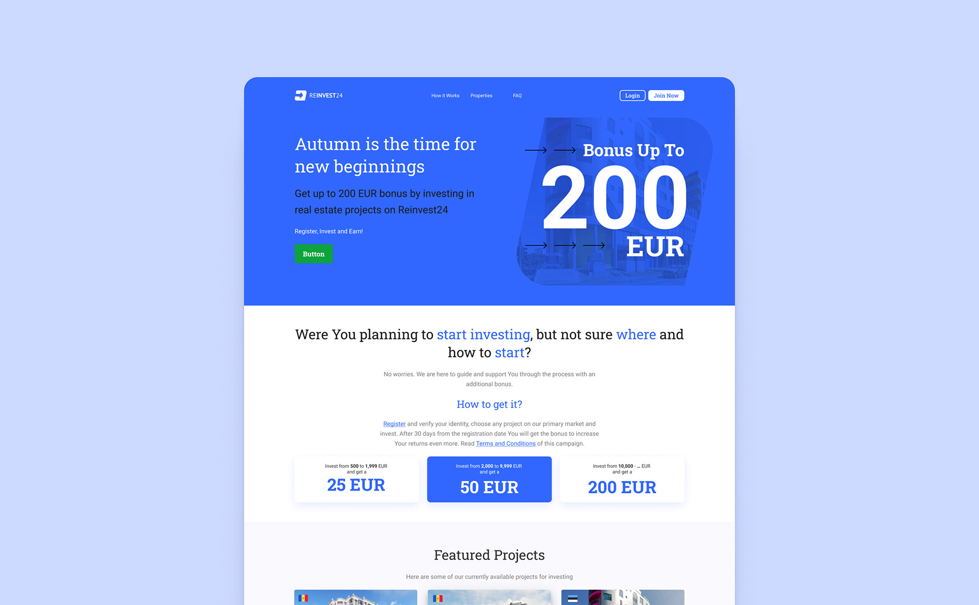
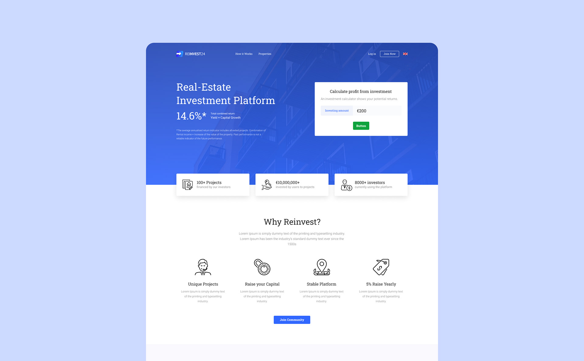
Reinvest24 is a real-estate investment platform serving users who need to discover, compare and manage investment opportunities. The redesign focused on making a complex financial product clearer, more consistent and easier to navigate.
Challenge
The platform needed to support two different levels of experience. New investors required clear guidance and a simple path through unfamiliar decisions, while experienced users needed richer information, efficient comparison tools and greater control. The interface also contained inconsistent elements that increased cognitive load and slowed product development.
Users and audience
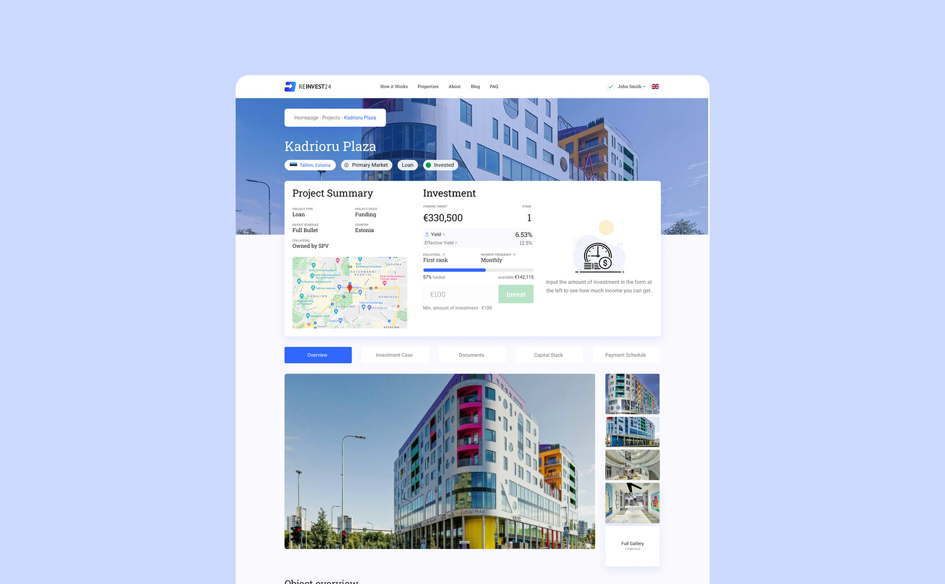
The product serves people exploring real-estate investment as well as experienced investors managing multiple opportunities. The design therefore needed progressive disclosure: essential information first, with detailed financial data and controls available when needed.
My role
As Head of UX, I led the experience redesign from discovery through prototype and developer handoff. My responsibilities included UX strategy, interface audit, information architecture, user flows, product design and the Figma design system.
Scope and constraints
The existing platform was built on a working framework, so the redesign needed to improve clarity and consistency without ignoring technical constraints. Reusable building blocks were essential for faster implementation and reliable QA.
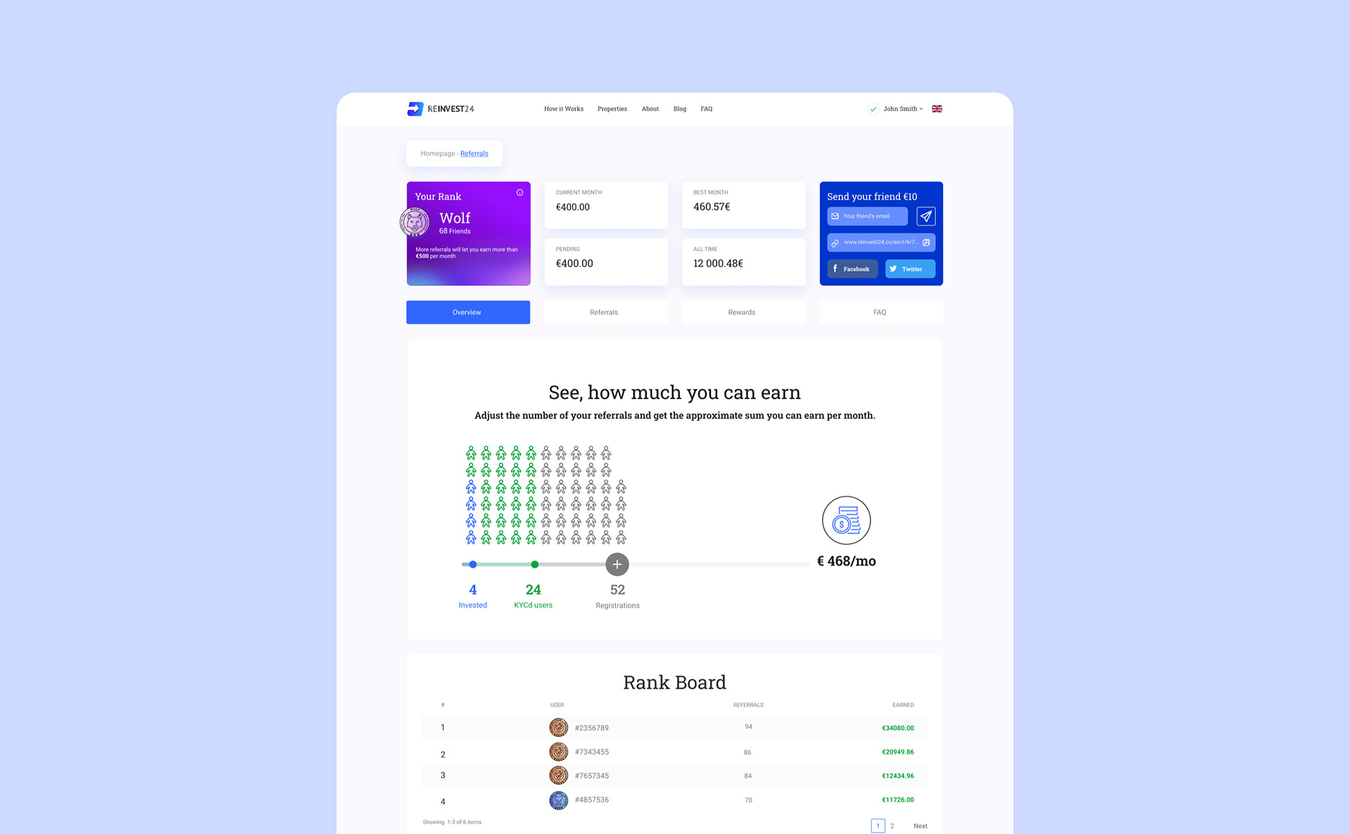
Discovery
The audit showed that interface elements, typography and interaction patterns needed clearer organisation. I mapped recurring components and established an atomic structure for a more coherent product system.
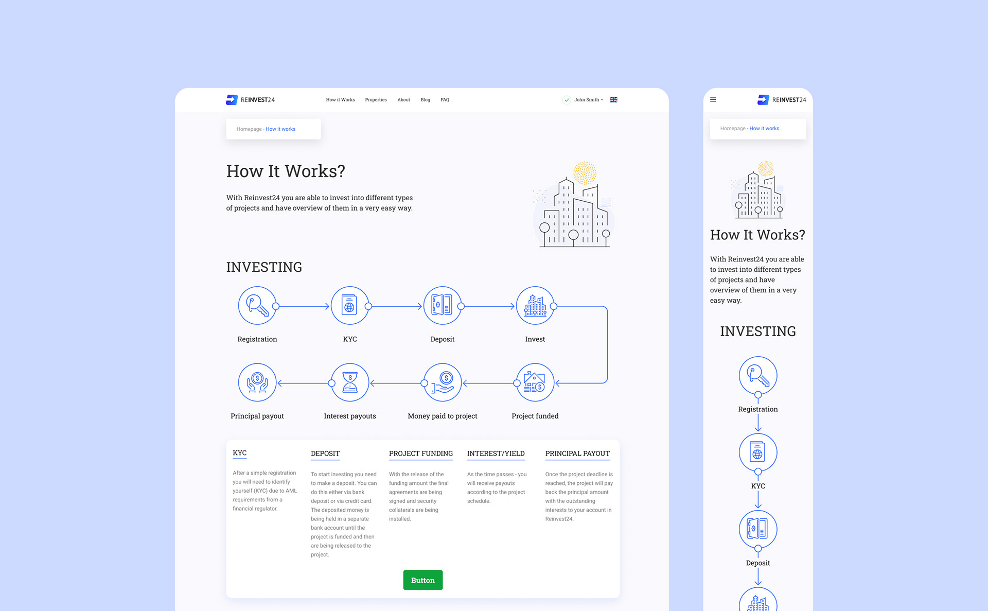
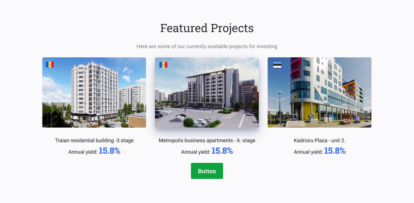
Research insights
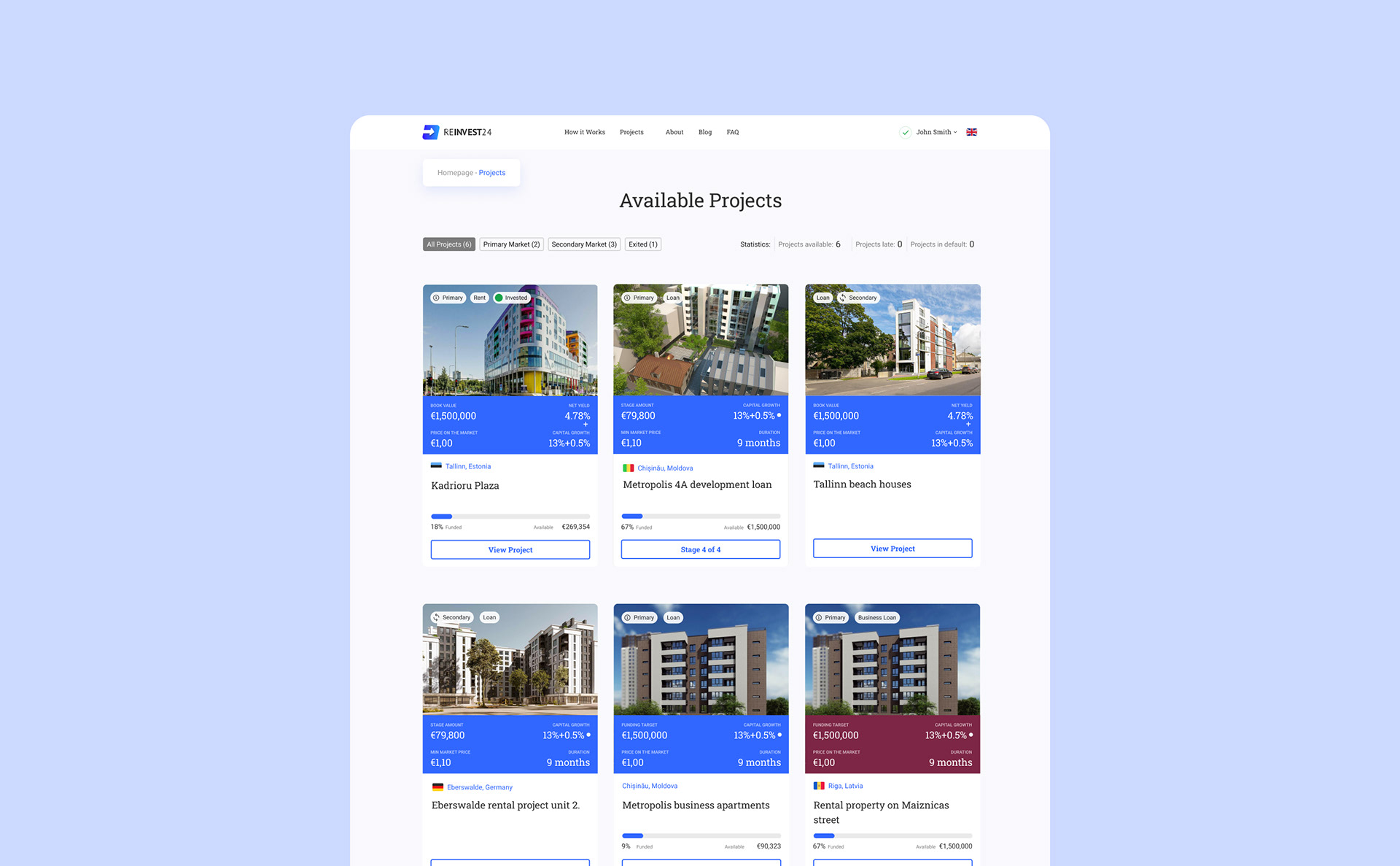
Users wanted to see available projects in one place and compare or sort them by meaningful criteria. Research also highlighted the need to make financing models transparent so people could understand and filter opportunities according to their own preferences.
Development
I have created the design system in Figma, where the atomic and molecular principles group the elements. This approach gave us saving in development and QA time.
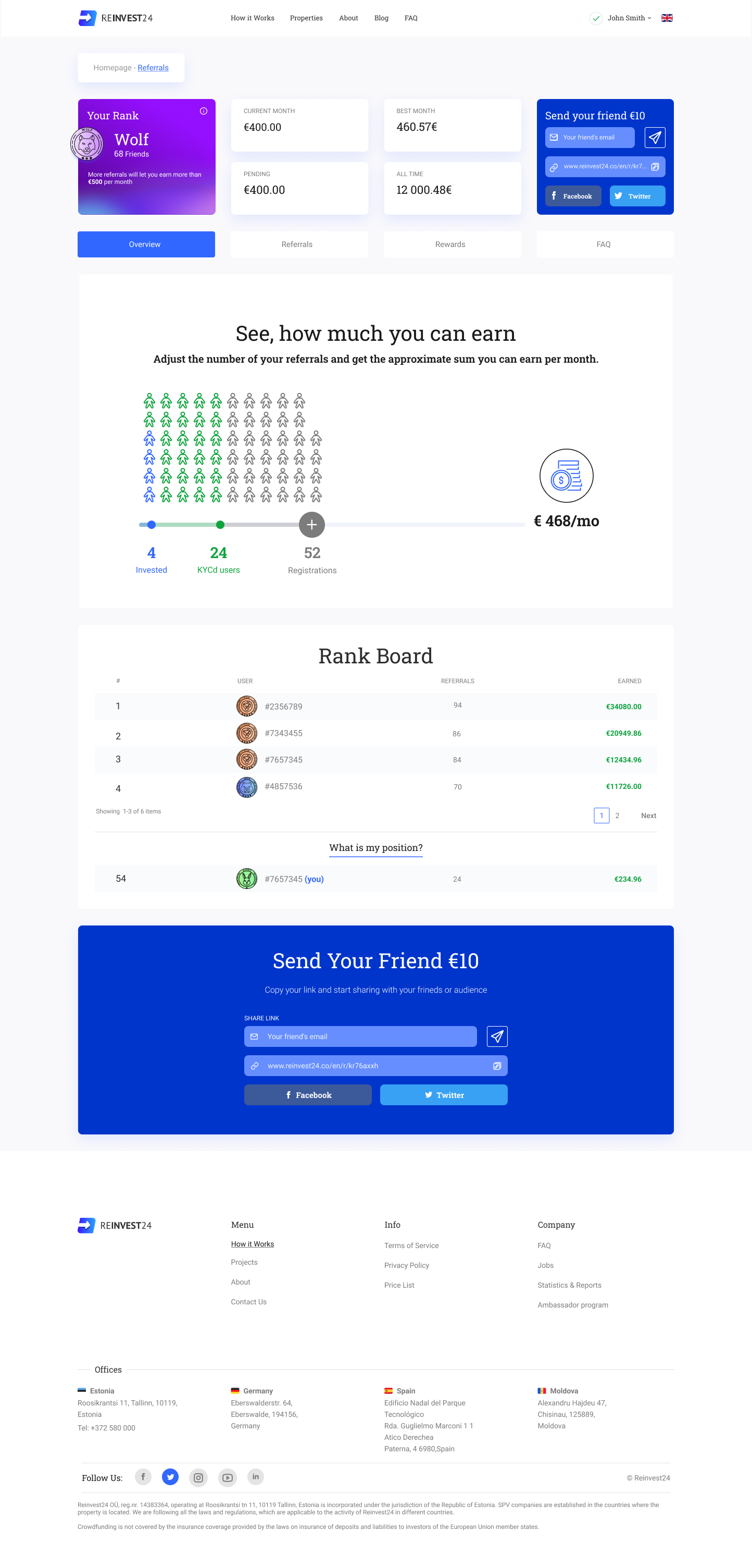
Prototype and outcome
I built and maintained a high-fidelity Figma prototype for stakeholder review, usability sessions and development handoff. The redesign reduced usability issues by 40% and created a more scalable foundation for future product work.